
11/11/15
In this blog I am going to perform a few PMI tests on a couple of double page spreads i found interesting in an issue of computer arts, though I do despise the magazines, they were the only ones which were available to us students at the time, therefore I may have to find one in another magazine in which I am a fan of.
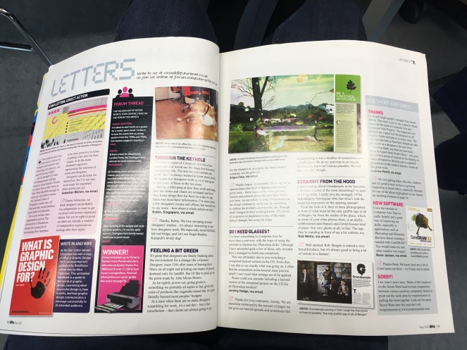
P – the fonts used in this piece are professional and the title is very readable making it be the first thing you see along with the high quality images.
M – The layout is a bit poor and all over the place making it hard on where to decide to start reading. Also the illustrations are rather small and you don’t really notice them.
I – The colour use is interesting as of how they mix them together with dark and light areas. Making one of the images on the right come out from what it looks as if the page template looks affecting and may be useful maybe in this project or another project later on in the course.
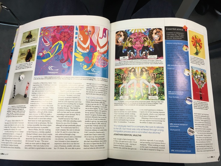
P – The layout is a bit better than the last one and I like the way they left some kind of template sketch as you can see some lines to run off the page saying that they used these lines as some sort of guideline.
M – Though the layout is alright there is no some sort of heading which tells us about the page, this may be because there might have been a page before it related to it soo my bad!
I – I like the way most of the imagery are illustrations with wicked colours within them, which leads plenty of attention to them. This would have been useful if I were to do the project on my first choice which was Ravers.
This has given me a rough idea on how my page should and should not look like, though the pages aren’t the same size as what the Creative Reviews are I will be preforming a PMI test on a few pages from the issue I’ll be buying soon!

Leave a comment